

Mid-Century Modern Kitchen Design
An encore of this home’s former glory and emphasizing it’s Mid-Century Modern flair
When I was invited to walk this project, I was excited by the address. Las Vegas doesn’t claim too many things as its identity, especially in architecture and design. We are known for grand, overscale, glitzy properties that line Las Vegas Boulevard. Anything with character gets torn down or gutted to create something new.
On the other hand, this home was in the center of town in an area known for its Mid-Century Modern and Hacienda style homes. I love this type of architecture, and the community it was in screams Old Vegas. This was going to be a fun project!
As we reviewed the scope of work and the direction we were heading, my client said “I love quirky and fun” and “I want it to feel Mid-Century Modern”… SOLD!
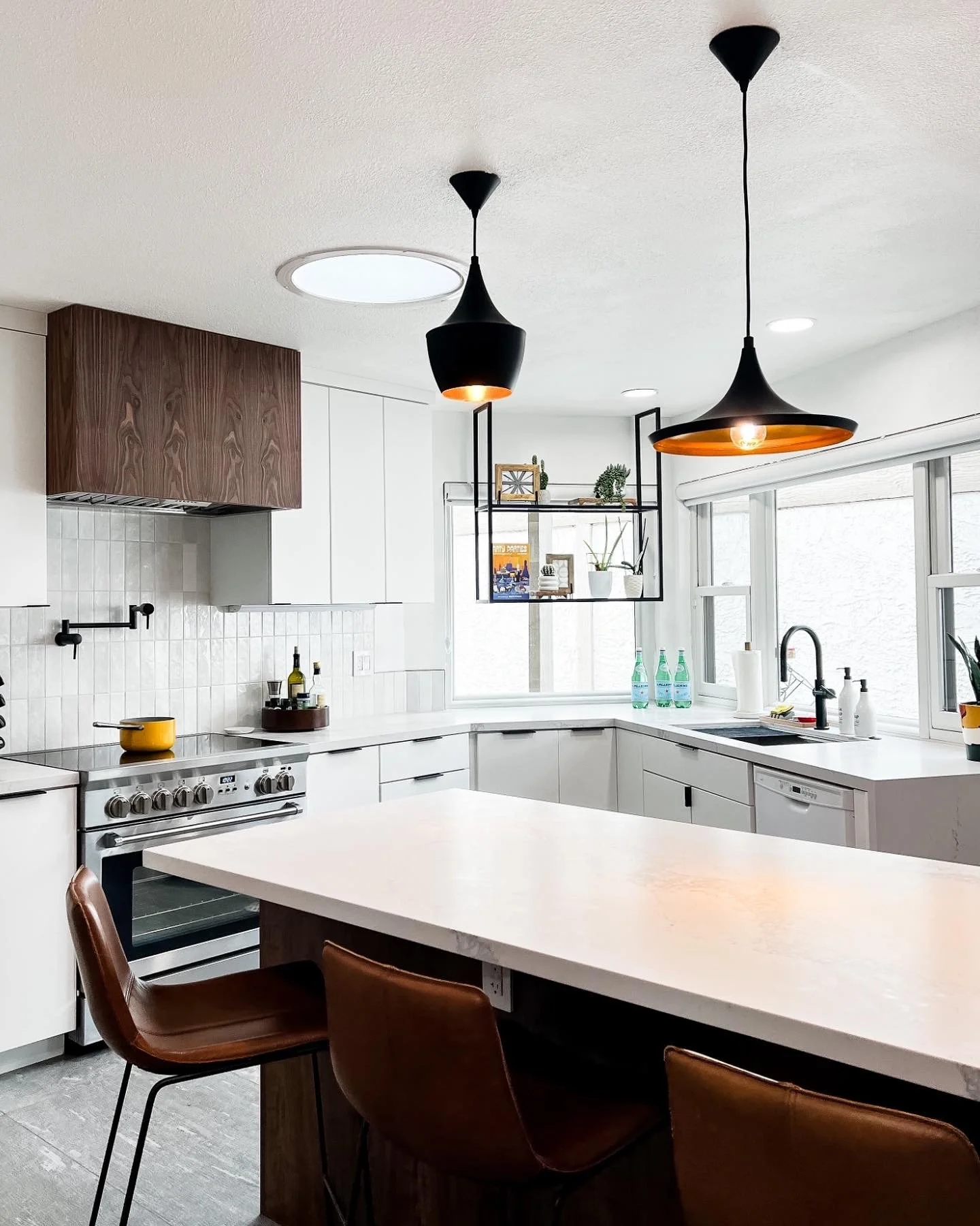
The original kitchen had some functional issues, which is very common in old homes as technology and appliances change. The dishwasher couldn’t be loaded when standing at the sink since the door would open right where you were standing. The refrigerator protruding into the kitchen’s work area made it hard to navigate around. An awkward peninsula had very little usable seating and divided the space in two. Finally, the soffits only highlighted the typically low ceilings in homes built at that time.

When a kitchen has this many inherent issues functionally, I always recommend new millwork. Relocating plumbing and electrical and changing the kitchen's footprint requires some major work. Dust, take-out, and constant construction were in their future!
We worked with Element Cabinet Design, a local millwork shop, to create the new clean kitchen. A big ask from the client was a large island with storage and seating - so we worked on the largest island we could. Adding flat sawn walnut accents at the island and hood really added warmth to the space and a nod to its original Mid-Century style. The remaining cabinets would be a clean white with simple finger pull hardware. Clean, minimal, and classic.
Don’t worry, the character came with the addition of eclectic black and gold light fixtures that highlighted the length of the new island. All made possible by removing the soffit and shifting the refrigerator to the opposite wall. An entire millwork section was added along the kitchen’s back wall (that was the dining area), full of storage. It completely changed the feel of the kitchen. It opened everything up and allowed for so much natural lighting to reflect around the space.
The two metal shelves were added for my client to add in some fun - plants, vintage finds, and cookbooks. OneFortyThree made them custom for us!


After long months of dust and demo, the kitchen was finally put back together. Thanksgiving was a whole new world for my client, she had some much space to line up her assembly line as she cooked in her kitchen. We worked with Ferguson Kitchen and Bath for our appliances, and my client couldn’t be happier with her AGA range!
But it didn’t end here! The fun continued into the guest bathroom, which serves as their powder bathroom.
As the kitchen was underway, we shifted our eye to the bathroom. This is the bathroom party guests use and should be a reflection of the home.
There was a lot of texture on these walls, which had to go. The tile in the shower was older, and they had some issues that needed to be remedied. The function of the bathroom was great, no need to alter the shower size or vanity placement. This was a straightforward renovation, but we needed to find the wallcovering to grab people’s attention!
This is where Phillip Jefferies comes in! We found it in their vinyl after searching for the right pattern, cost, and material. I love wallcovering, especially in bathrooms - the only trick is clean-ability. Vinyl fits the bill and allows my clients to wipe away any splashes with its durability but have the look like fine paper. Perfect for this space!


Once we had the paper selected, the walls were prepped following some work behind the drywall - and we were in business!

My client was handy enough to visit a local cabinet shop and fit out the vanity on their own. The wallcovering was the perfect backdrop for this Mid-Mod space. The shower tile pattern in a basketweave echoes the square design in the wallcovering, and the blue niche accent added another layer of geometry and pop of color. We added a decorative mirror and repeated the varying height concept from the kitchen pendants here in the bathroom.
Pulling in some orange from the kitchen, art and a planter in the shower add another layer of color to the space. Prints from Society 6 follow the same lines as the wallcovering and make the perfect compliment - since you don’t want anything to outshine that patterned wallpaper!